A modernised identity that brings motion, colour and photography up to today’s standards, aligns with One Good Thing, and performs across product, brand and direct response without creative fatigue.
Capital One
Fintech
2024
Principle Designer
Motion guidelines
Colour thoery
Photography art direction
Type and layout
Modular DR templates
Creative direction
Cross-functional workshops
Test-and-learn planning
Creative rotation strategy
Playbook writing
Capital One set out to refresh its brand so marketing and product felt like one story. My remit was to lead the creative direction for motion, evolve the colour palette to include gradients that echo the optimism of One Good Thing, and define a bolder photographic style that puts the card and the customer at the centre. At the same time the refresh needed to serve performance marketing. Direct response teams wanted a wider variety of creative that could be tested at pace across channels, with clear rules that kept work accessible, compliant and recognisably Capital One. The outcome had to be a system that looked modern, shipped fast and scaled from app micro-moments to high-reach media.
I began by aligning product, brand and performance stakeholders around a small set of principles so decisions stayed fast and consistent. For motion I defined guidance that separated useful behaviours in product from expressive moments in marketing. In product the focus was on clarity and feedback, with timing ranges and easing that help people understand what has changed. In marketing the aim was surprise and delight used sparingly to draw the eye, support a single message and resolve into a readable end frame. Everything was documented with simple examples so designers and editors could apply the rules without guesswork.
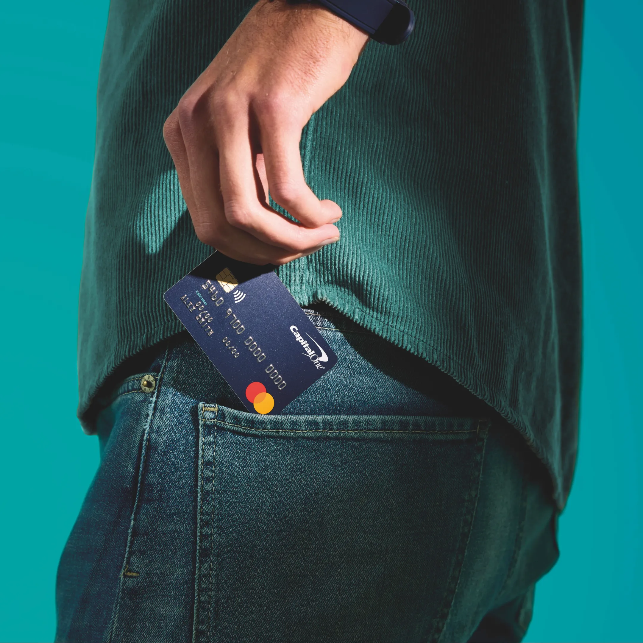
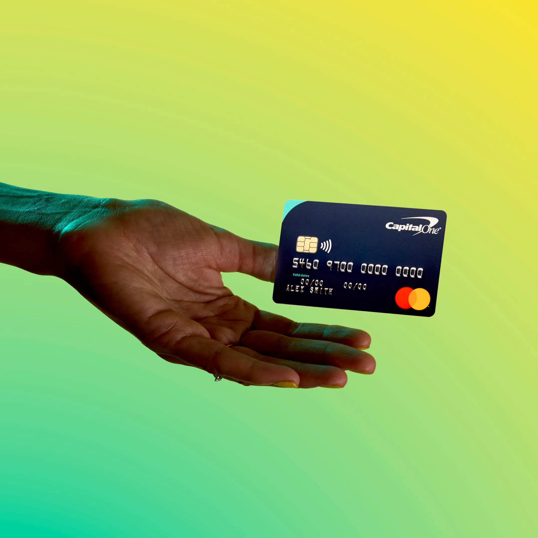
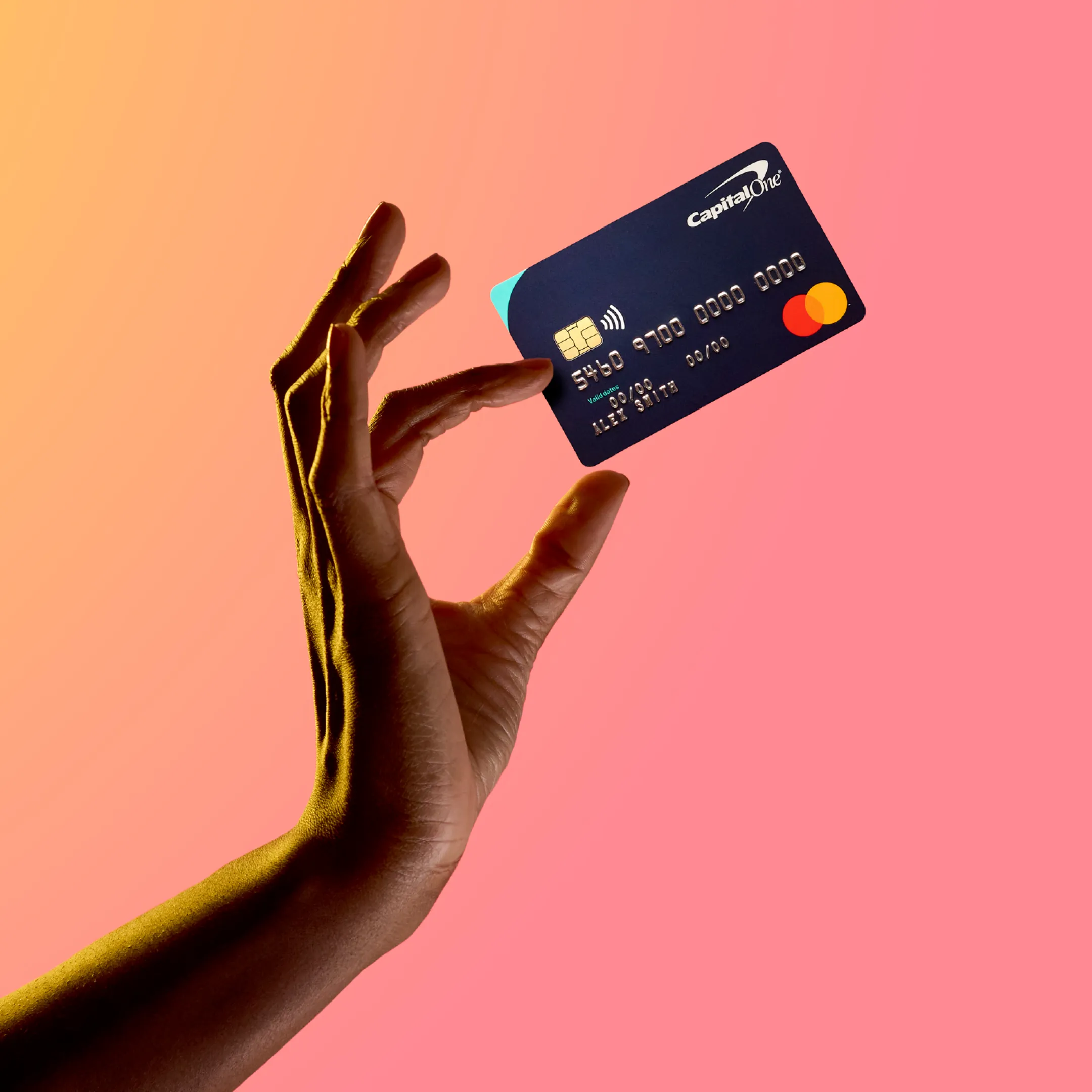
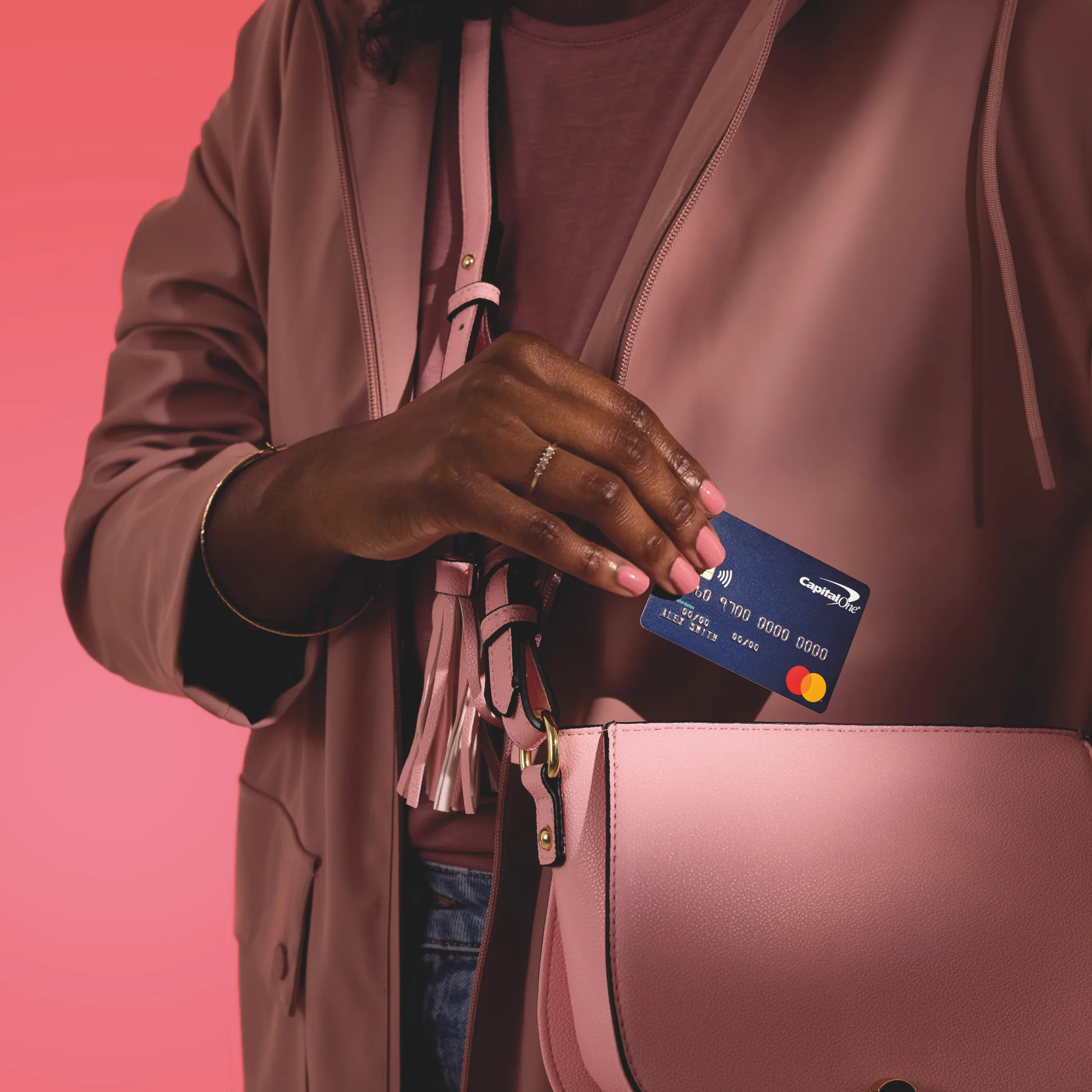
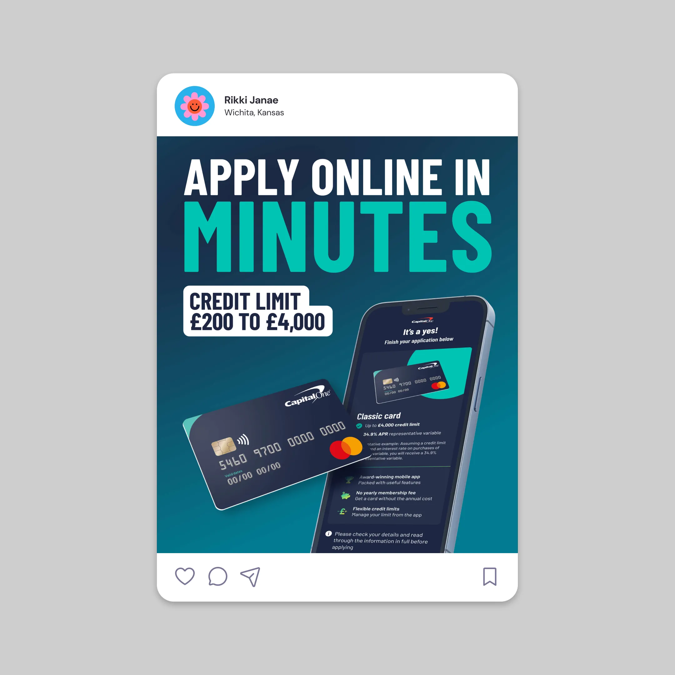
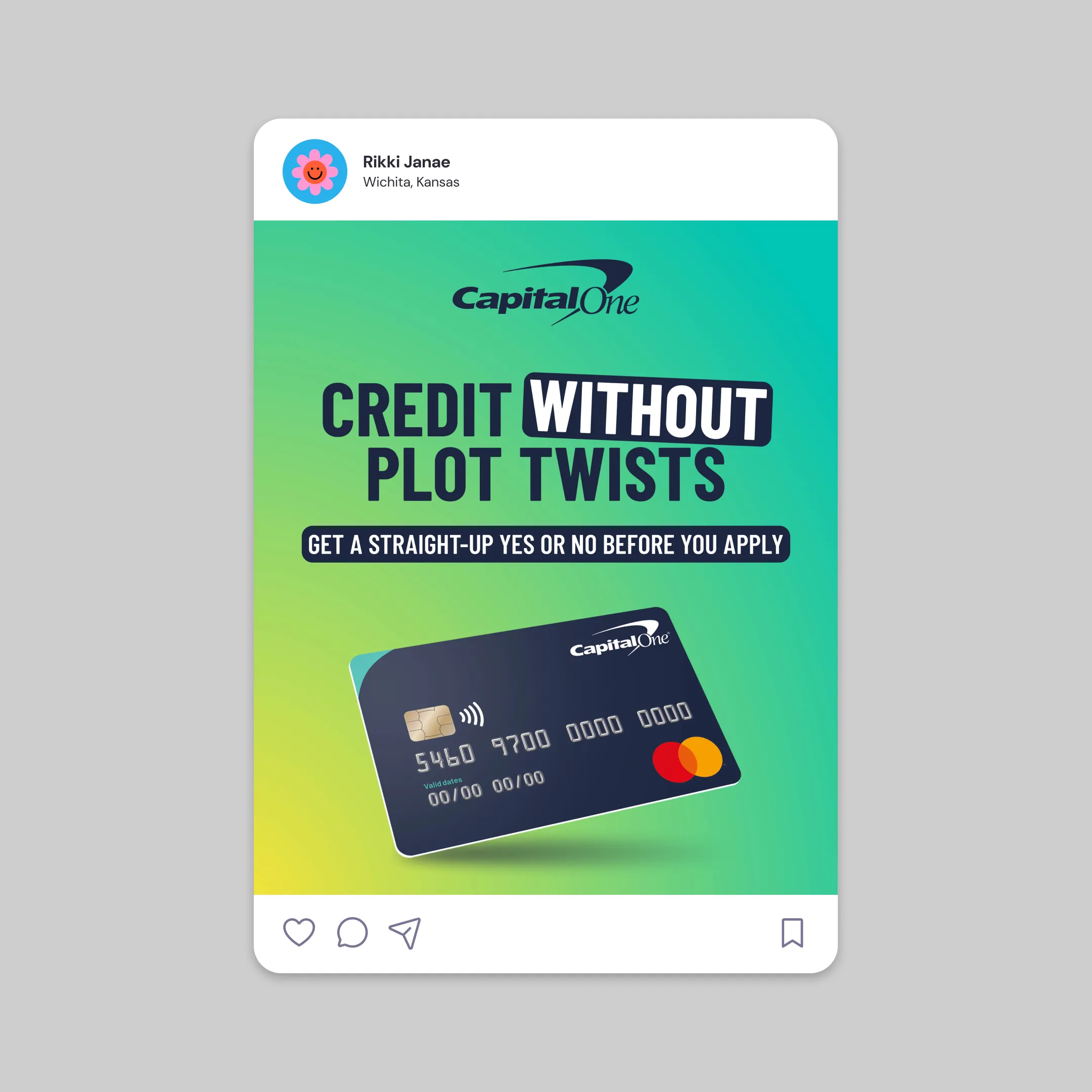
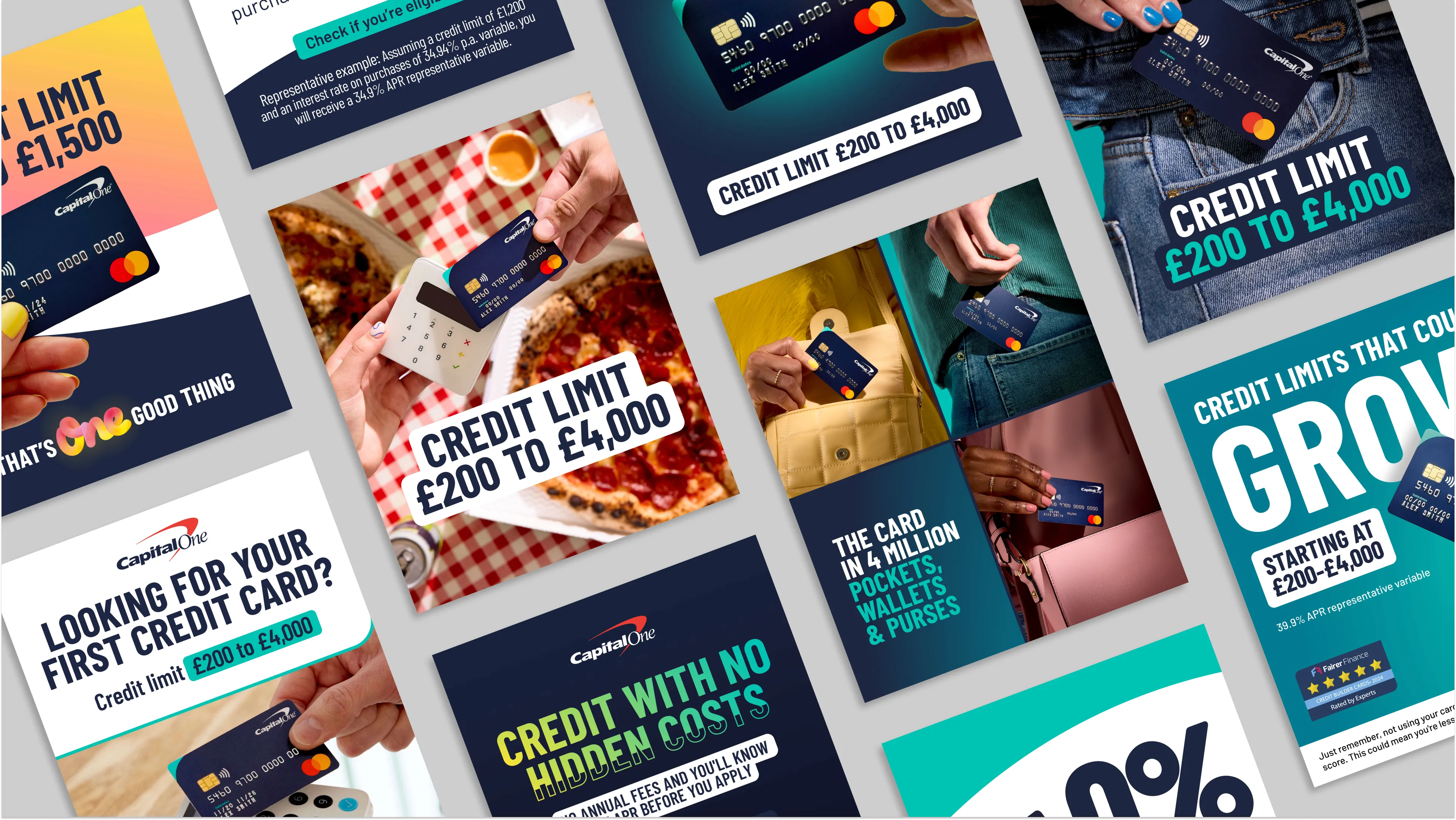
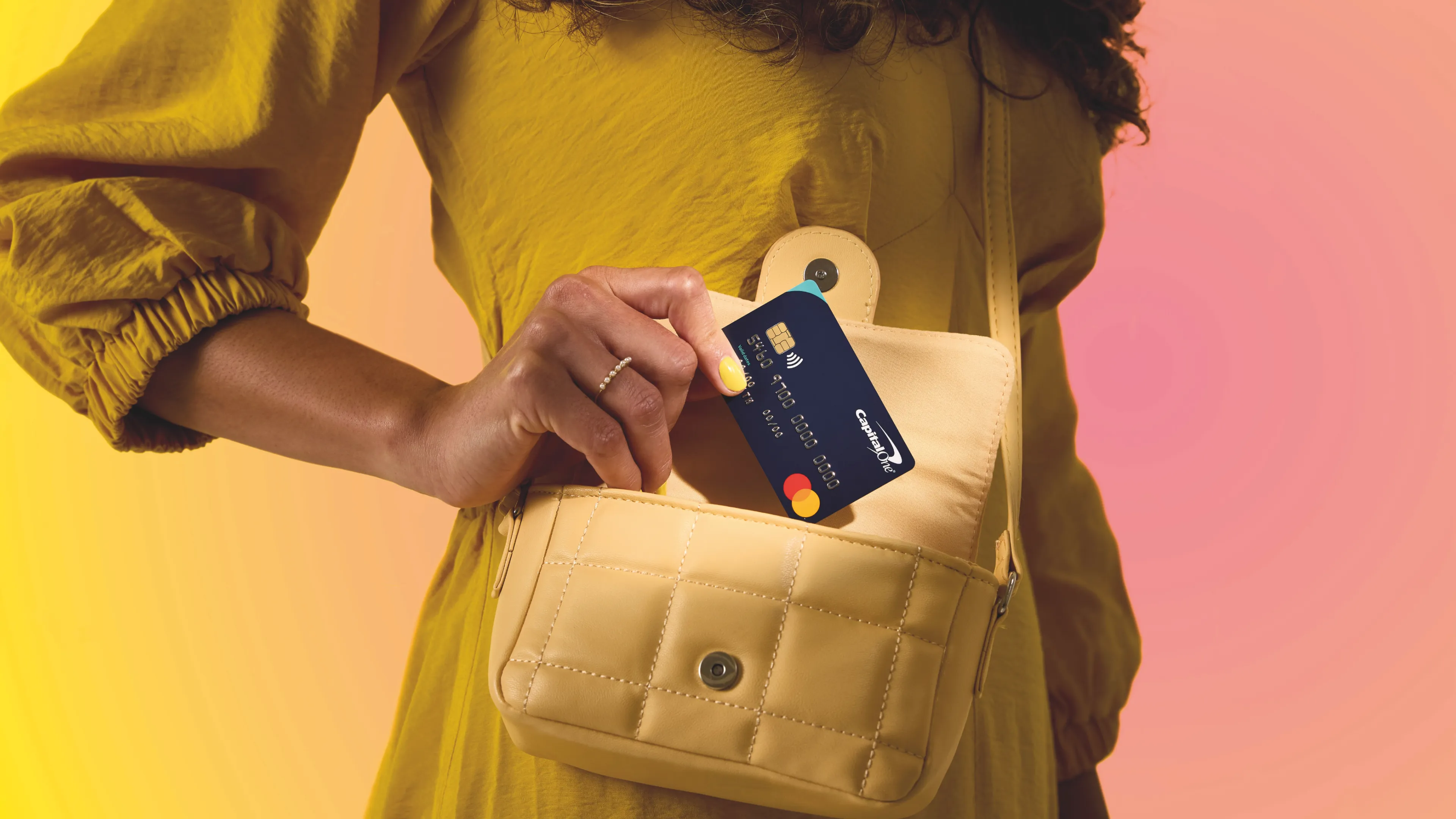
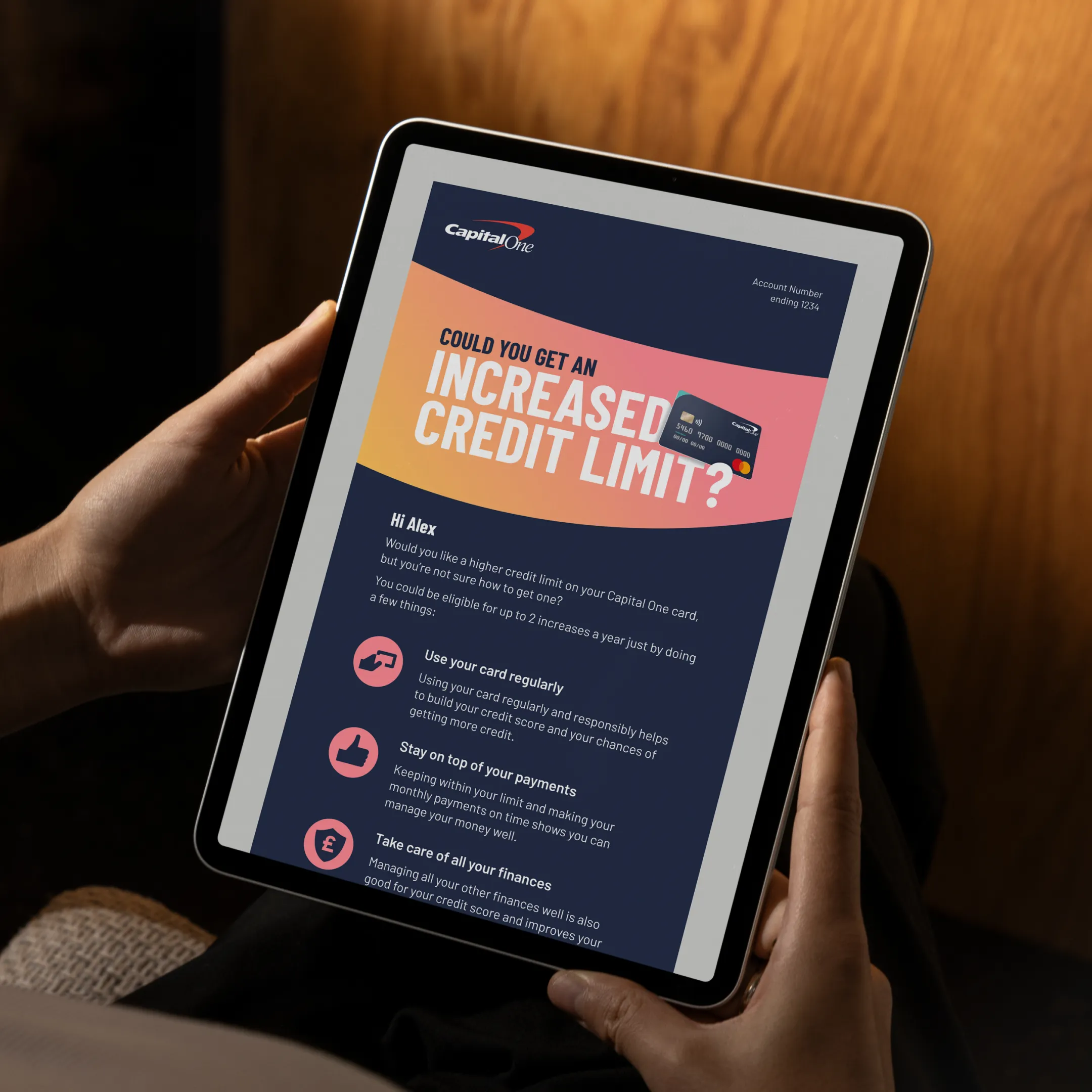
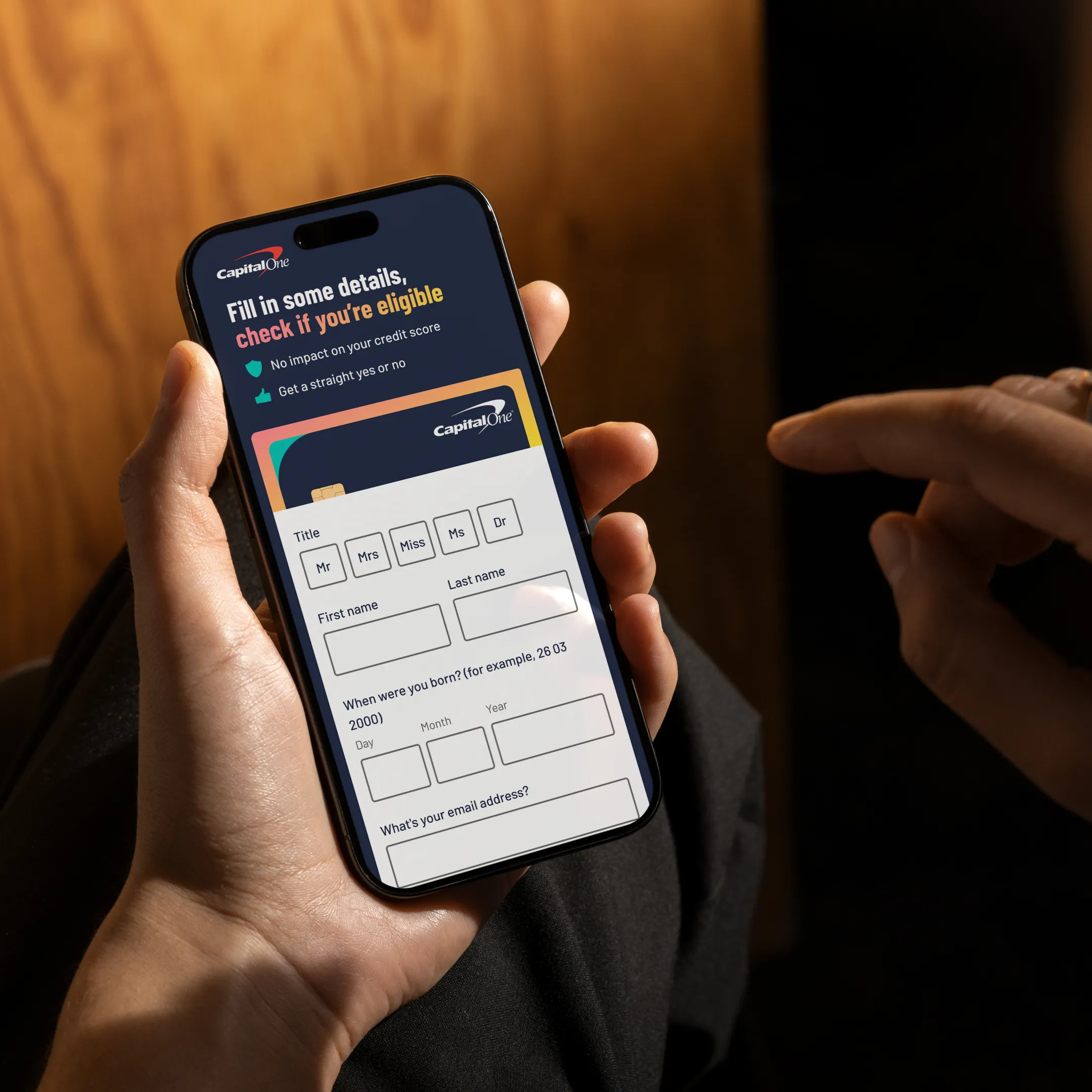
I evolved the palette into a gradient-forward system that carries warmth and energy while remaining practical. Primary and support blends were specified with contrast guidance, tints for type and UI, and fallbacks for dark backgrounds. This created a visual bridge to One Good Thing and gave teams richer tools without introducing noise. I set a photographic direction that feels current and human. Dynamic framing, confident colour and straightforward lighting keep the card and the customer in the foreground, while composition and cropping rules make the imagery work cleanly from small placements to large format. The guidance covered how to brief shoots, how to pair images with type, and how to maintain accessibility through contrast and legibility.
To support direct response I built a modular advertising system that widened creative variety without diluting the brand. Headlines, benefit lines, card renders, price and legal modules, and call to action blocks were designed to recombine cleanly across ratios, which let the team produce many distinct executions while keeping hierarchy, motion and end frames consistent. I partnered with the performance team to define a testing cadence, a simple naming convention and a rotation approach that helps avoid creative wear. Templates were produced in Figma and After Effects so production could move in parallel across channels, with clear handover for media partners.
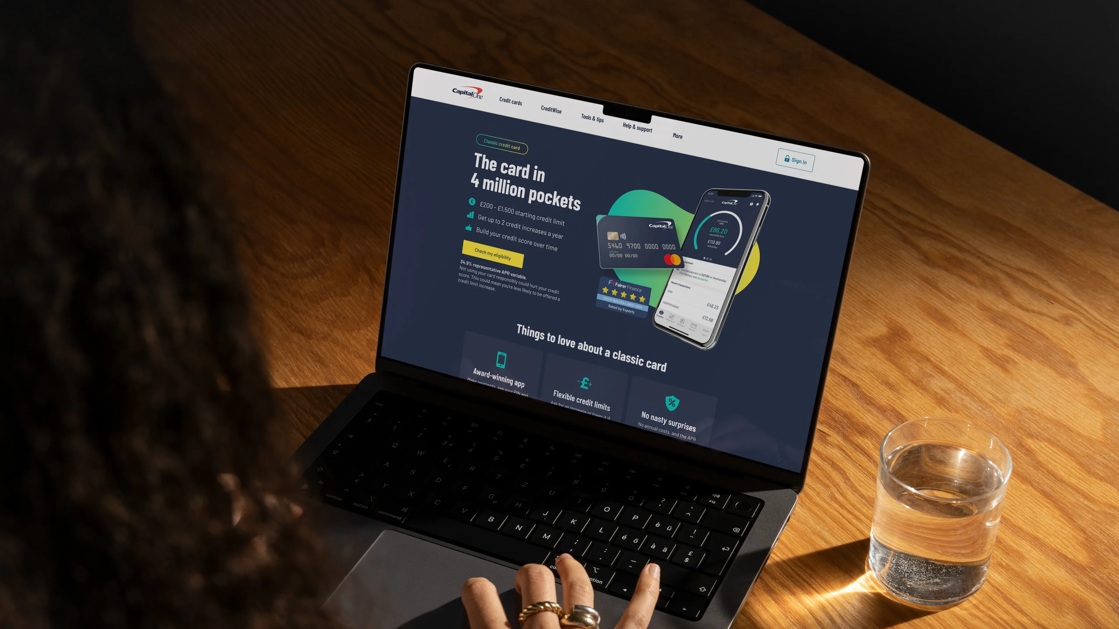
The refresh delivered a single language that works from app interactions to out of home and paid social. Motion became a practical tool rather than decoration, improving comprehension in product and adding gentle moments of personality in marketing. The new palette gave campaigns a brighter, more optimistic feel that connects directly to One Good Thing while meeting accessibility requirements. The photographic direction made the work feel contemporary and people first, with imagery that reads instantly and scales without fuss.
Direct response teams gained the ability to test broadly without losing coherence, which reduced creative fatigue and increased the pace of learning. Stakeholders reported fewer review cycles, faster asset creation and greater confidence that new executions would land on brand. Most importantly, the system is easy to maintain. Designers, editors and media partners can produce new work quickly, and the brand now shows up with the same clarity and character wherever customers meet it.